← All work
RESEARCHDESIGN

Kwai Shop checkout & payment

Brazilian shoppers were reaching checkout but not paying. Research found two separate leaks in the funnel, and I redesigned both.
ROLE
Product Designer, research lead
TEAM
PMs, data scientists, engineers
TIMELINE
Jun – Dec 2024
METHODS
Interviews, usability testing, information architecture, A/B testing
Kwai Shop checkout & payment cover
+6.44%checkout conversion
+7.36%payment success
16Brazilian users in interviews & usability tests
01

Two leaks in one funnel

Kwai Shop users in Brazil were arriving at checkout but not completing purchases. Payment success sat around 40%, against an 84% industry standard. Funnel data pointed to two problems: shoppers left the checkout page before placing an order, and 46% dropped off right after landing on the PIX payment page.

KWAI BRAZIL E-COMMERCE FUNNEL · 30 DAYS
Home page1,000,00050% drop-off
Product page500,00040% drop-off
Add to cart300,00050% drop-off
Checkout page150,00070% drop-off
Completed orders45,000
Illustrative data showing the drop-off pattern; not actual Kwai business data.
02

Research

I ran a 3-week research sprint with 16 Brazilian users (10 returning, 6 first-time), combining in-depth interviews and usability tests. Participants also ranked the three most important sections of the checkout page.

"TOP 3 MOST IMPORTANT SECTIONS" · VOTES BY SECTION, IN PAGE ORDER
Shipping address3
Product information3
Add-on purchase0
FOLD — USERS DIDN'T SCROLL PAST HERE
Payment method11
Price details7
Shipping & delivery9
Shipping protection2
Fixed bottom checkout2
The three most valued sections were all below the fold.
03

What we found

The desire to buy was there. The interface was getting in the way.

Priorities were buriedThe information users ranked most important, like payment method, shipping fees, and coupons, was scattered or below the fold.
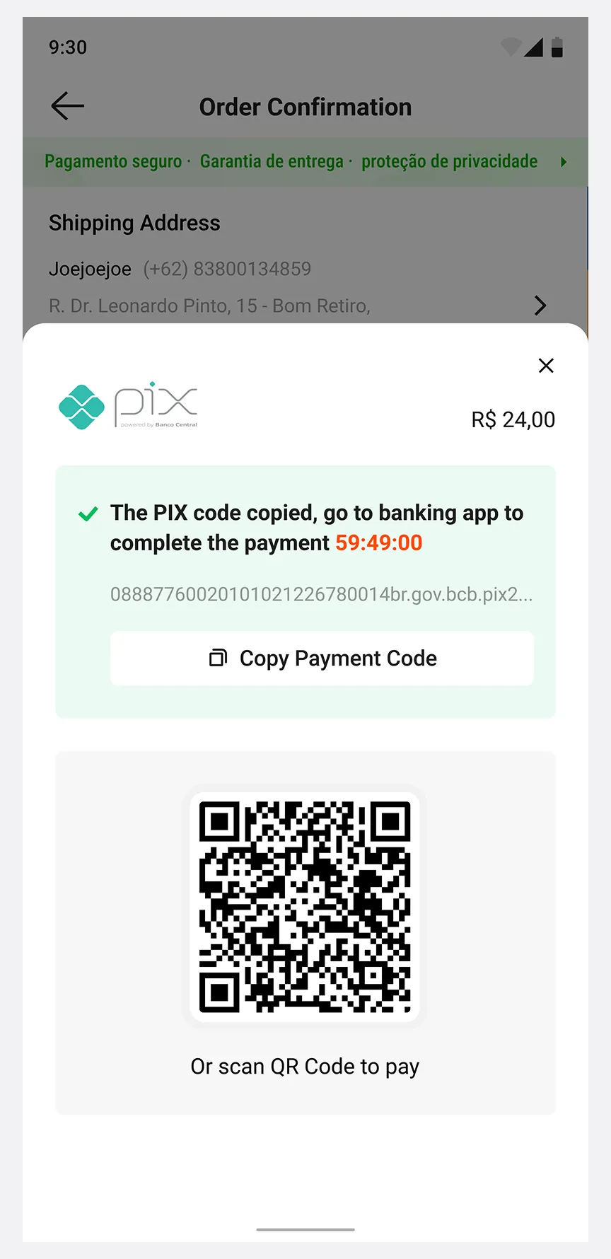
Users felt trapped in PIXIn usability tests, 0% of participants could find the option to switch to a credit card.
Switching felt riskyThe switch option sat inside a generic "Pay" pop-up, and users feared tapping it would finalize the wrong payment.
04

Part 1: Checkout page

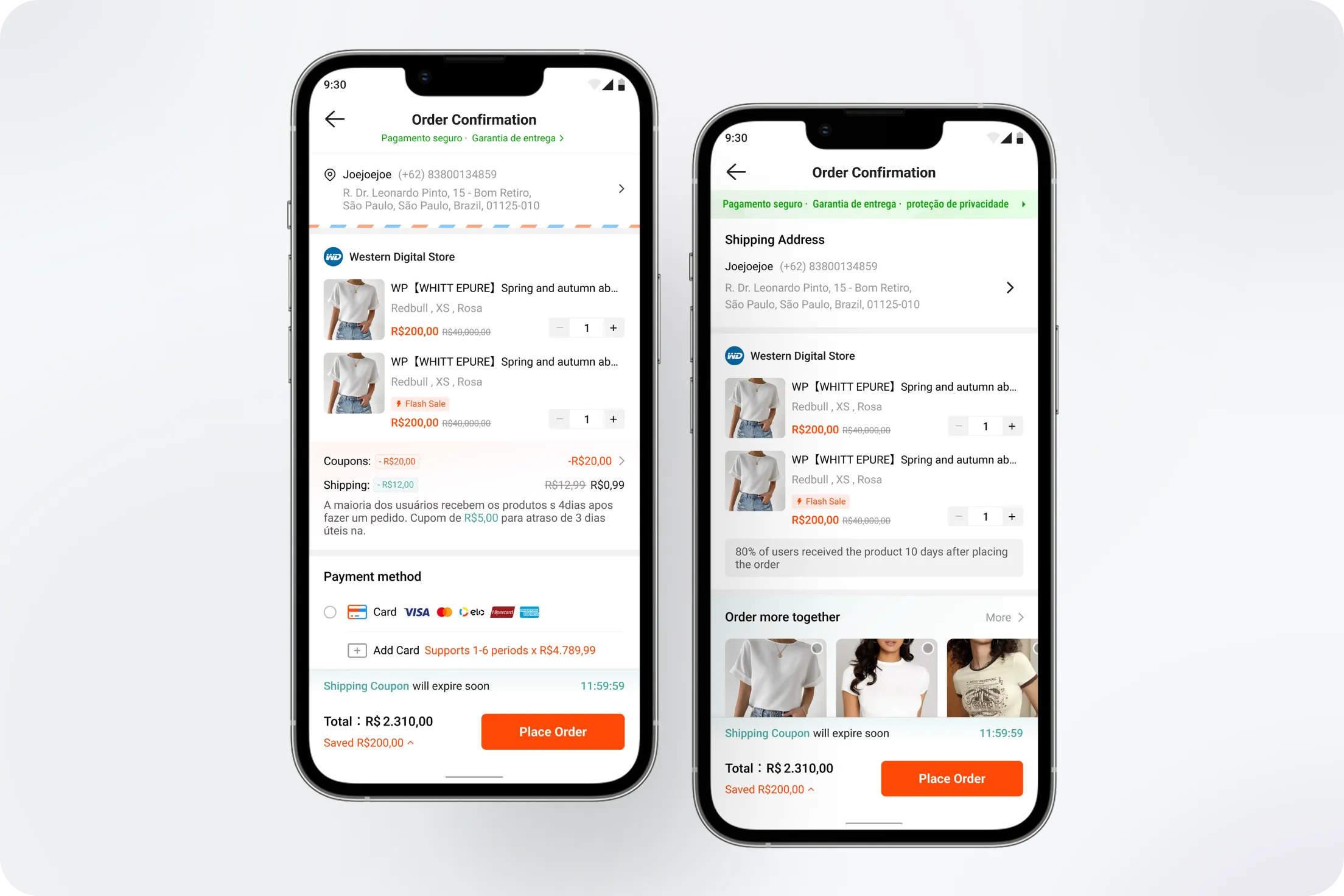
I turned the findings into three design principles for the checkout page. Each pair shows before and after.
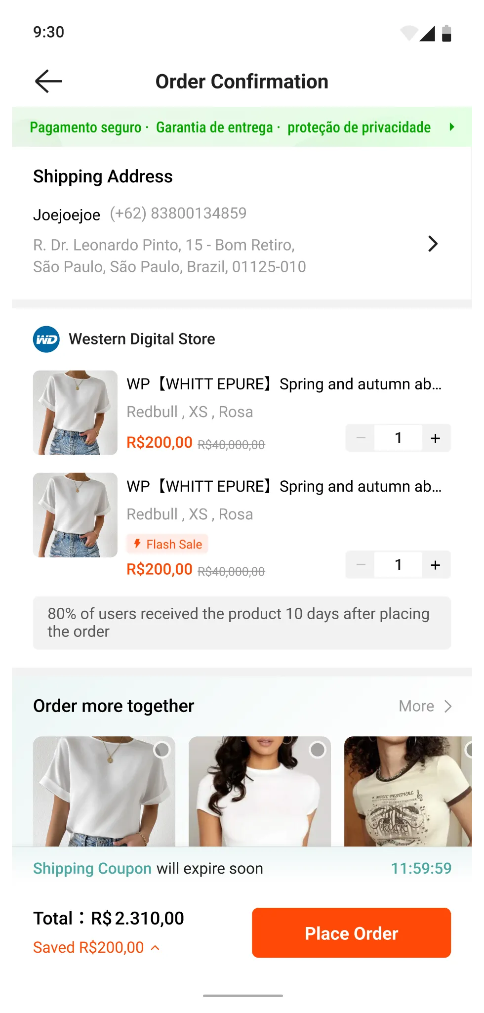
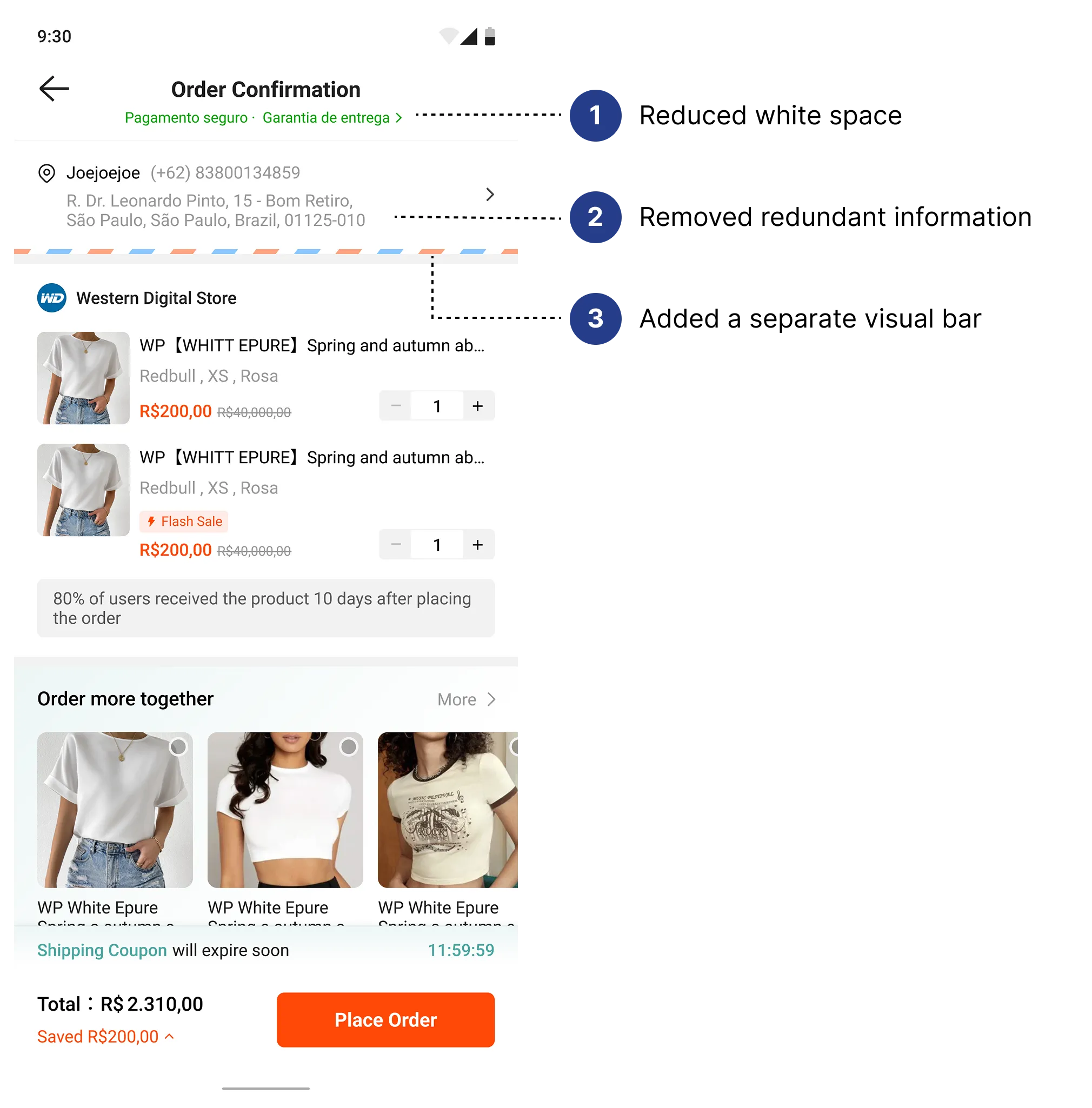
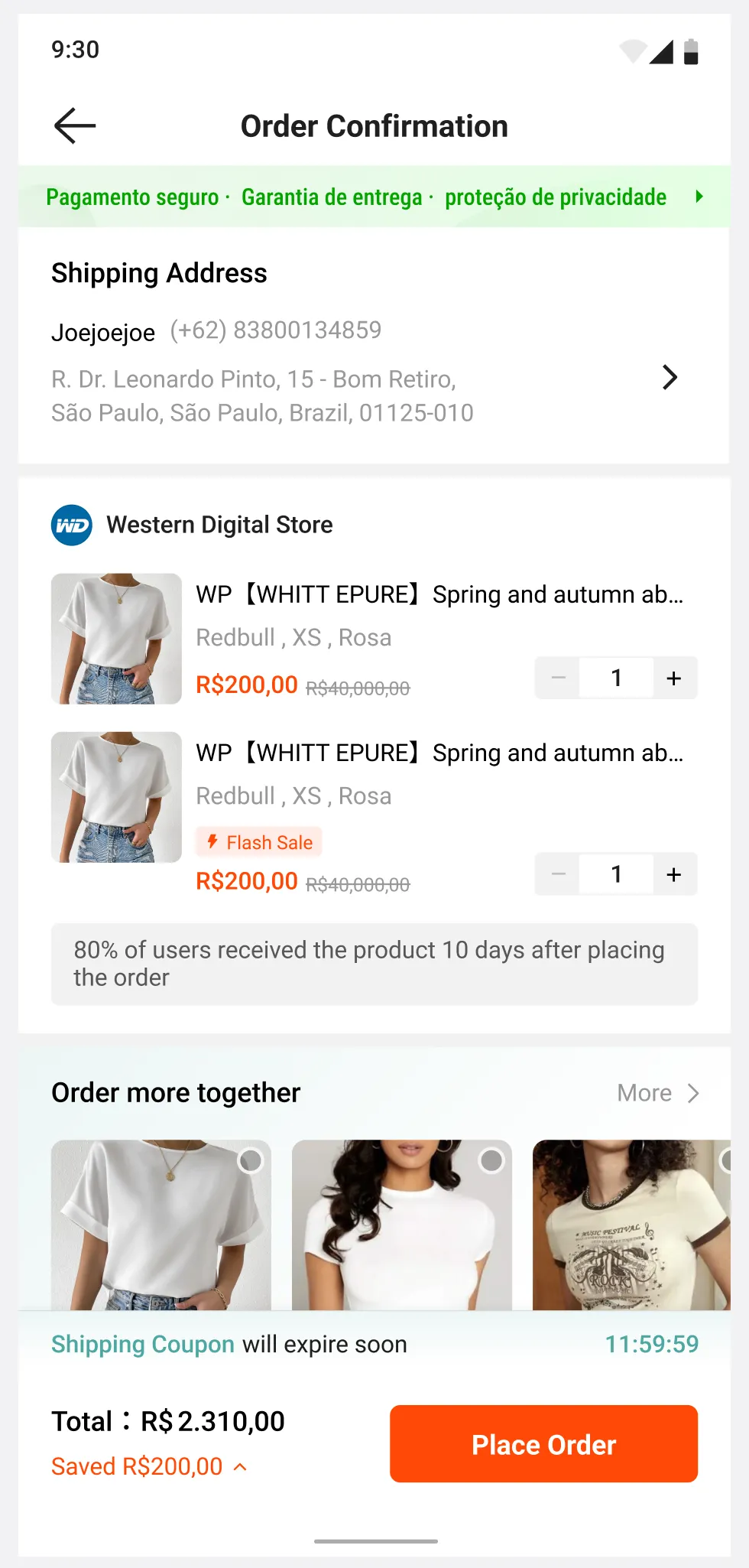
01Optimize screen efficiencyRemove redundant information and reduce white space.
Optimize screen efficiency — before
BEFORE
Optimize screen efficiency — after
AFTER
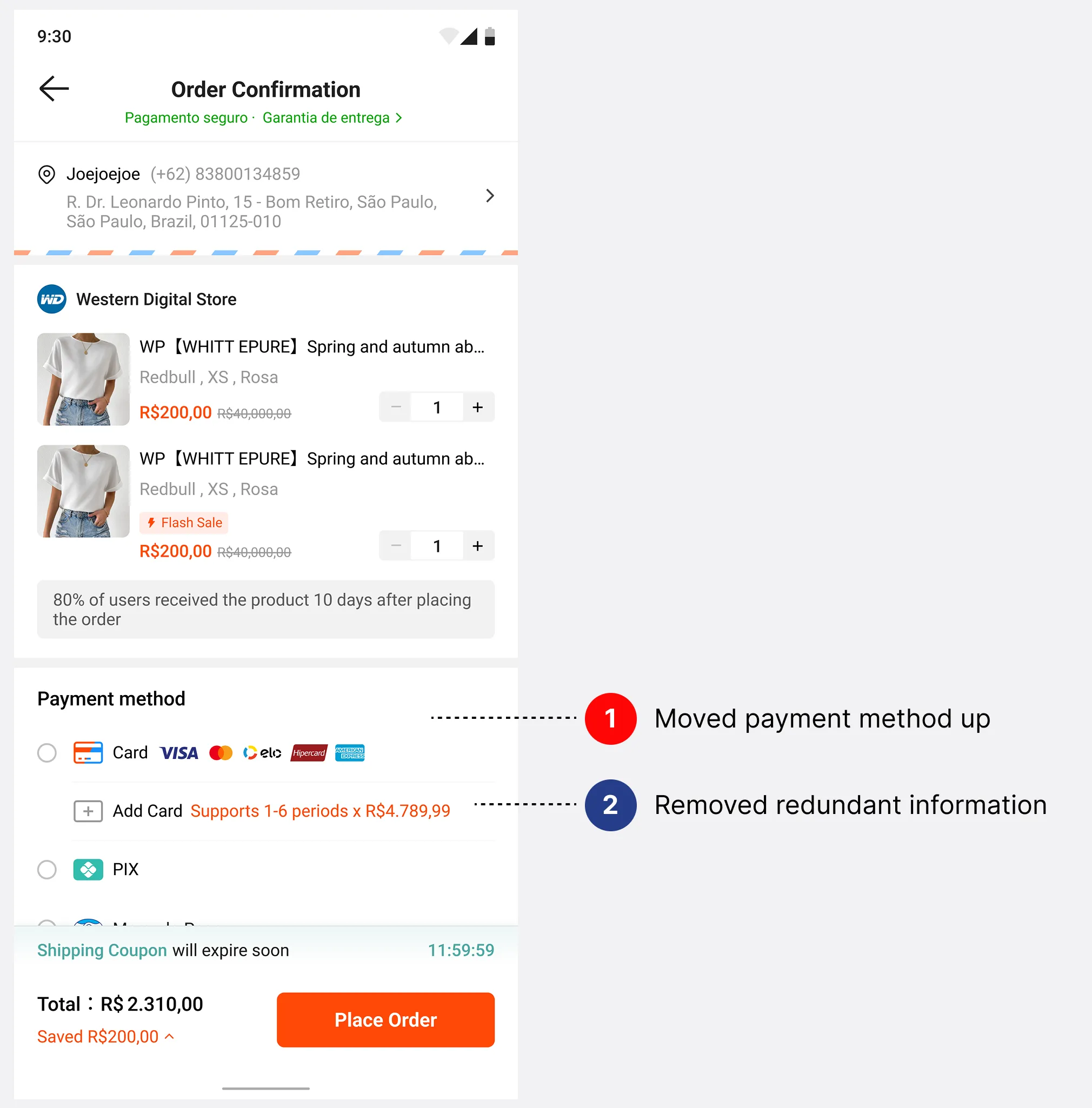
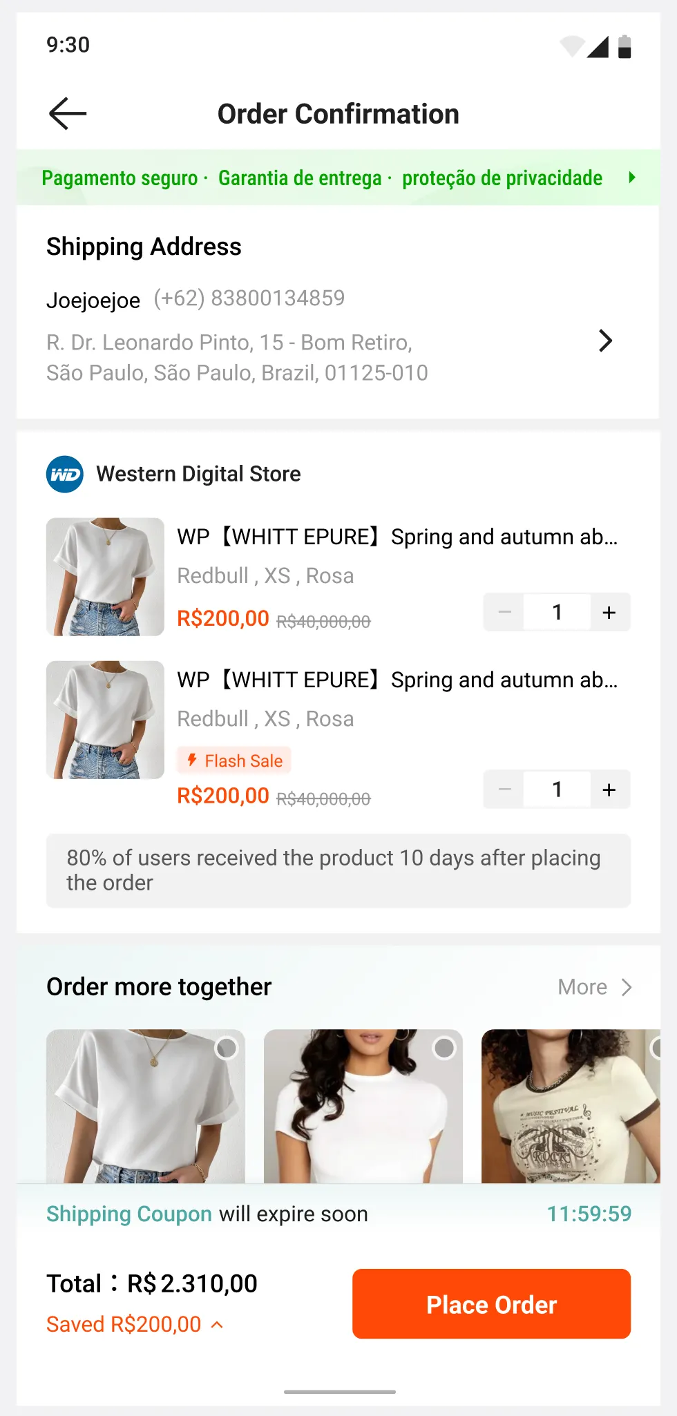
02Prioritize critical informationMove payment methods above the fold.
Prioritize critical information — before
BEFORE
Prioritize critical information — after
AFTER
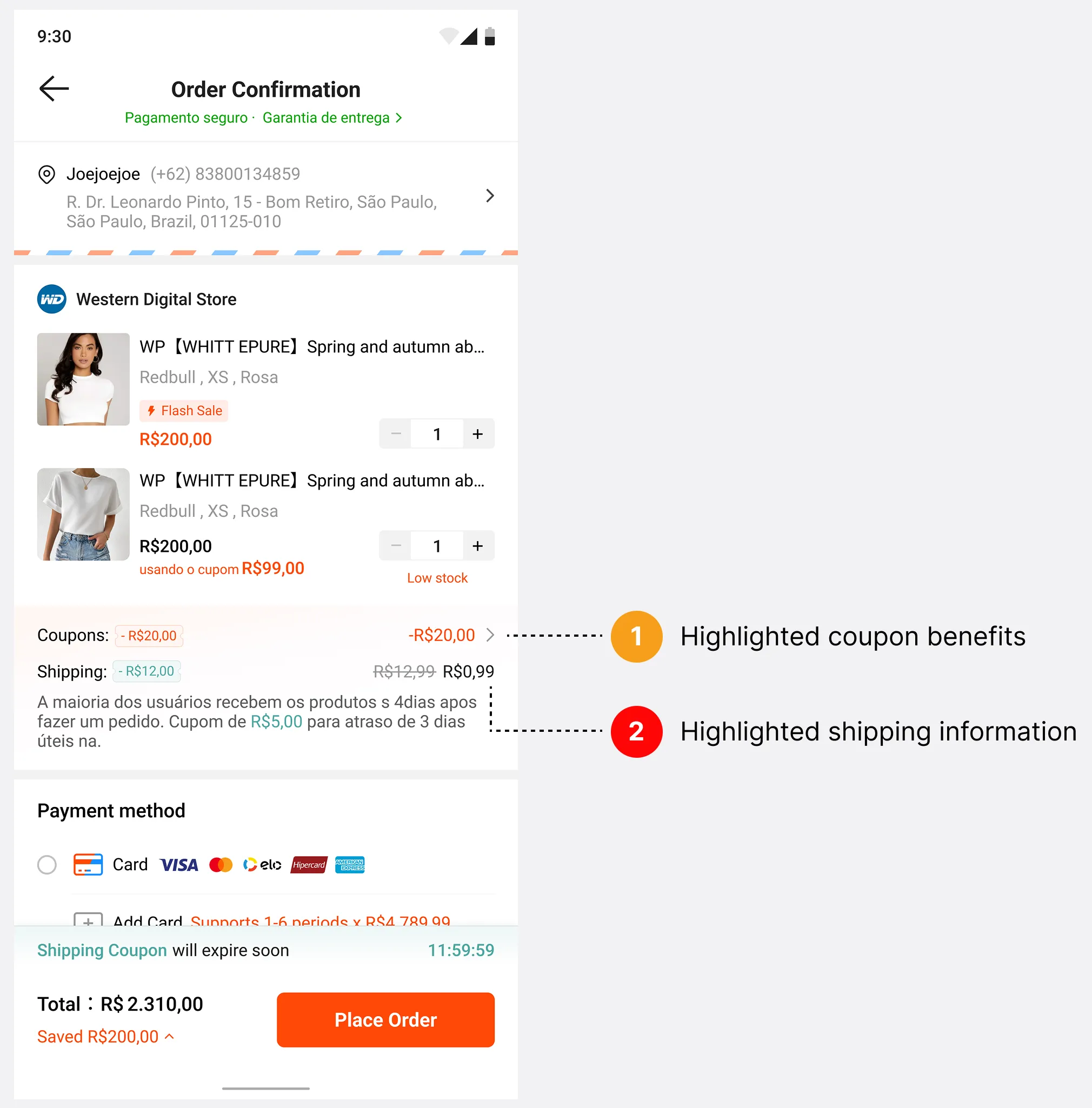
03Consolidate benefitsGroup shipping fees and coupons near product information.
Consolidate benefits — before
BEFORE
Consolidate benefits — after
AFTER
05

Testing each change

Before shipping the full redesign, I designed 5 A/B experiments against the original design to isolate the impact of each individual change.

Screen efficiency alone wasn't enoughOptimizing layout by itself didn't drive conversions.
Payment visibility was crucialMoving the payment method up drove the highest impact.
Shipping transparency mattersShipping fee visibility was the primary driver when highlighting benefits.
VARIANTCHANGEPAYMENT SUCCESS
ControlOriginal designBaseline
EXP 1Screen efficiency onlyNo significant change
EXP 2Payment method moved up+9.53%
EXP 3Shipping + coupons highlighted+7.36%
EXP 4Shipping fees only+6.91%
EXP 5Coupons onlyNo significant change
06

Final design

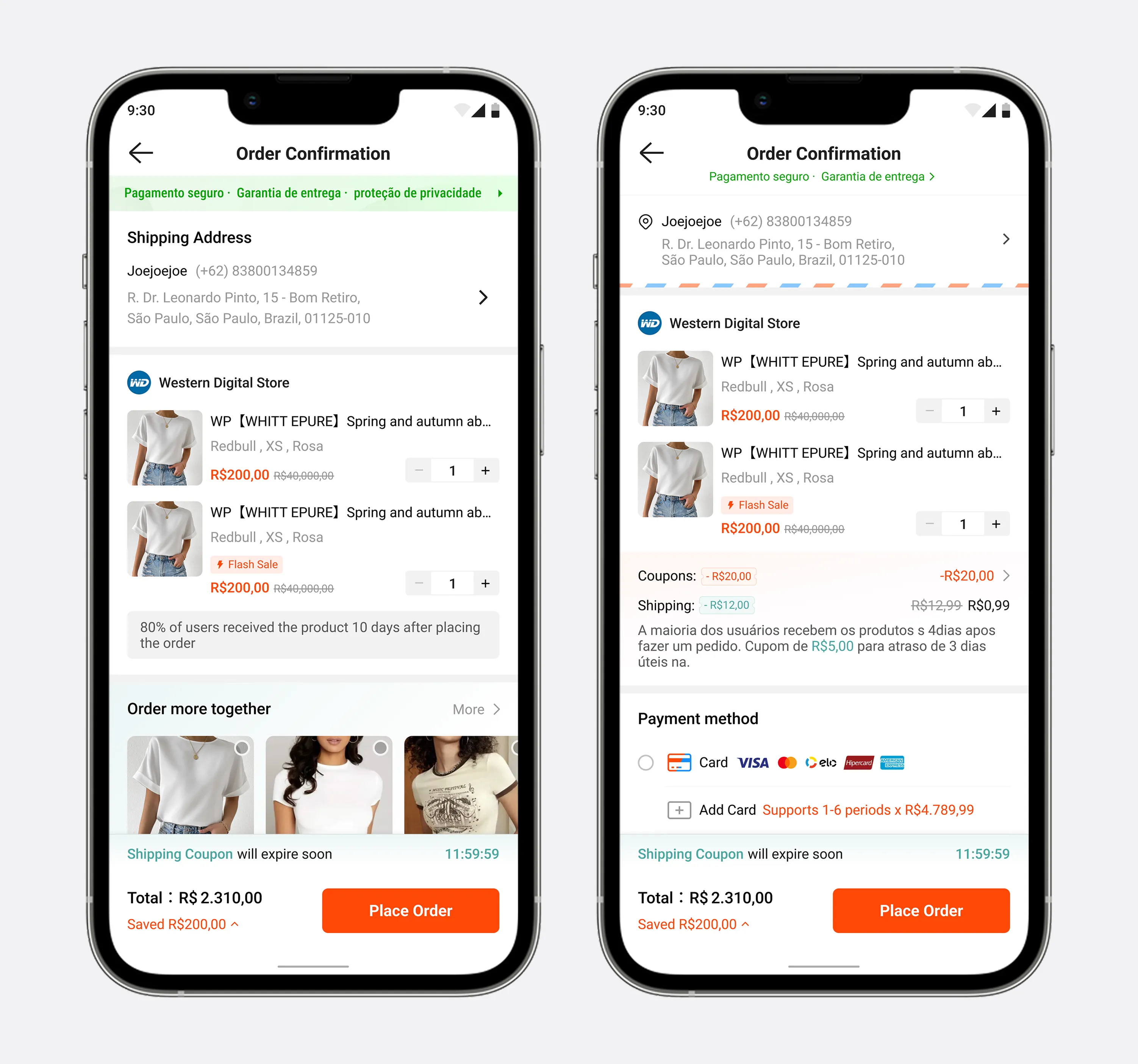
The shipped checkout page combines all three principles.

Checkout page — before / after
07

Part 1 impact

With all changes combined, the full checkout page redesign raised checkout conversion by 6.44% and payment success by 7.36%.

08

Part 2: The PIX paradox

Kwai defaulted to PIX, Brazil's instant payment system, because it is cheaper and faster than cards. Over 80% of transactions used it, yet its success rate was 38%. I presented the research to the PM: forcing PIX was not increasing adoption, it was killing conversion. We agreed on a principle that served both sides: keep PIX as the default, but make switching obvious and safe.

09

Unblocking the exit

Part 1 already moved payment selection above the fold, before the order is placed. After the order is created, I added clear switch entry points at three more moments of hesitation. Each pair shows before and after.
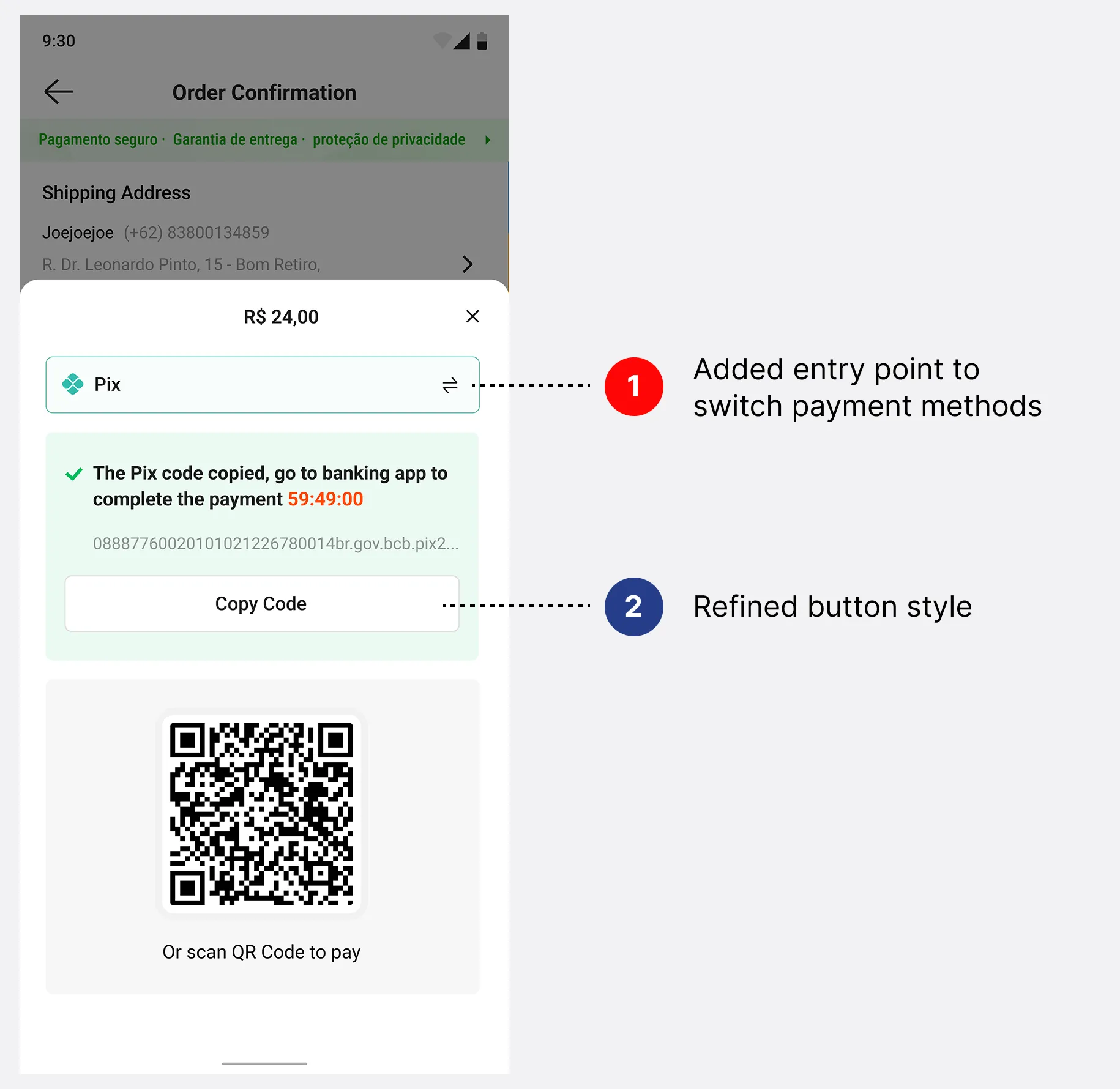
01PIX pop-up: the pivot pointA labeled switch option at the moment of payment, plus a clearer Copy Code button.
PIX pop-up: the pivot point — before
BEFORE
PIX pop-up: the pivot point — after
AFTER
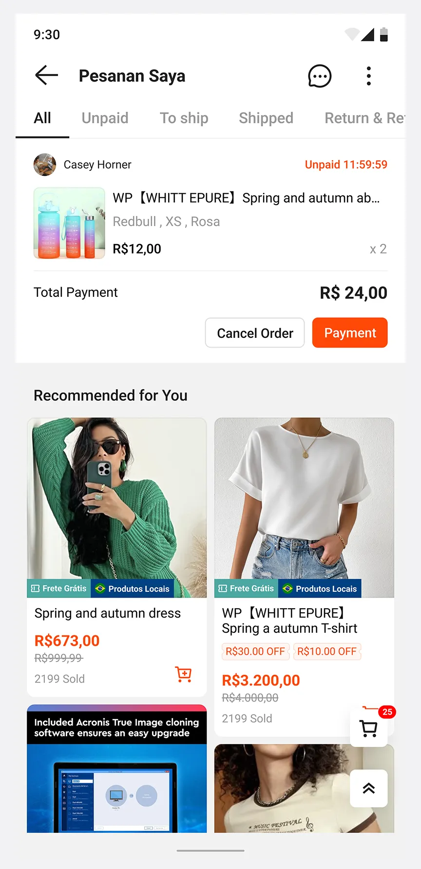
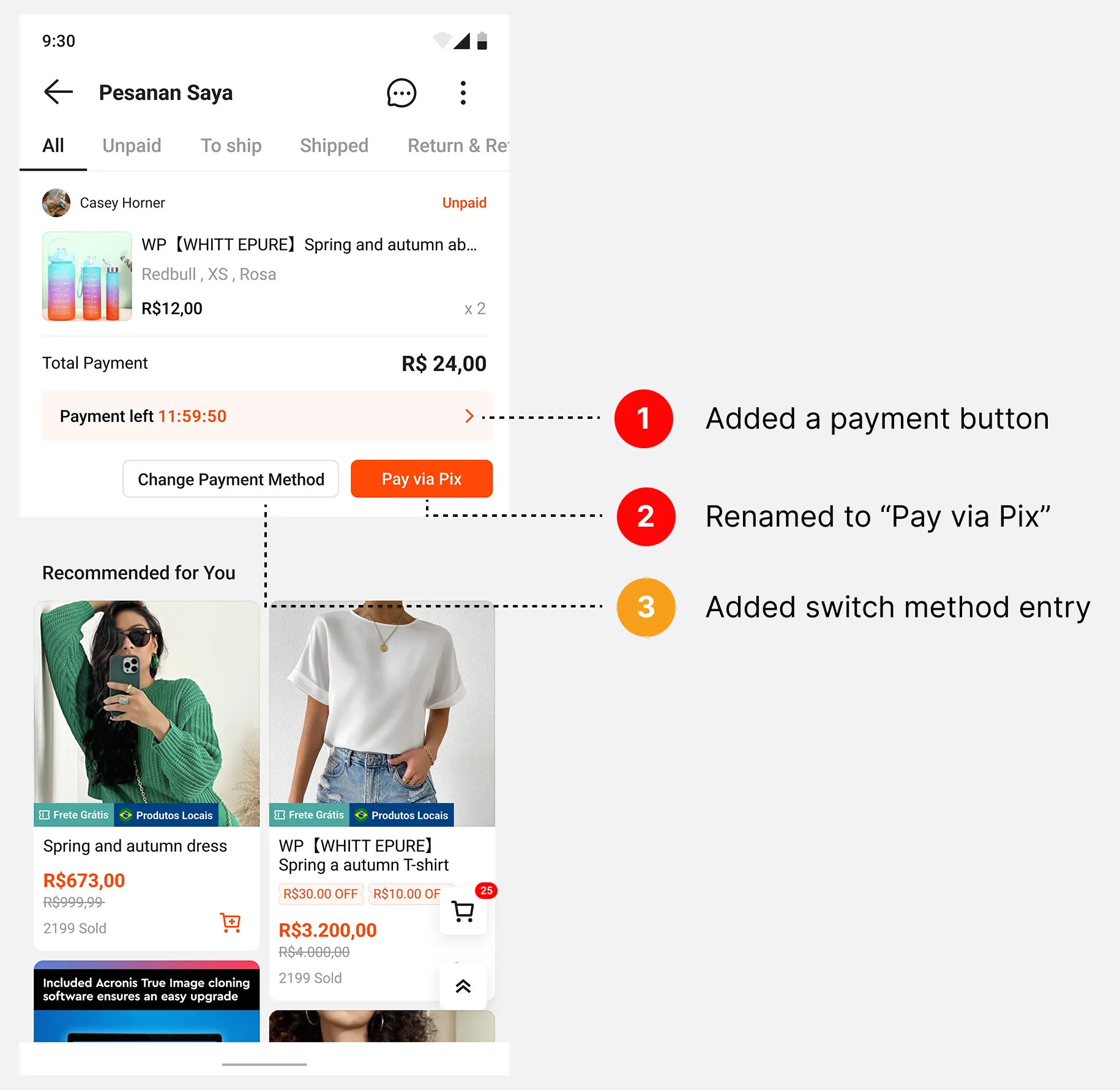
02Order list: the safety netUnpaid orders now show the time left to pay, a "Pay via Pix" button, and a "Change Payment Method" entry for users who left and came back.
Order list: the safety net — before
BEFORE
Order list: the safety net — after
AFTER
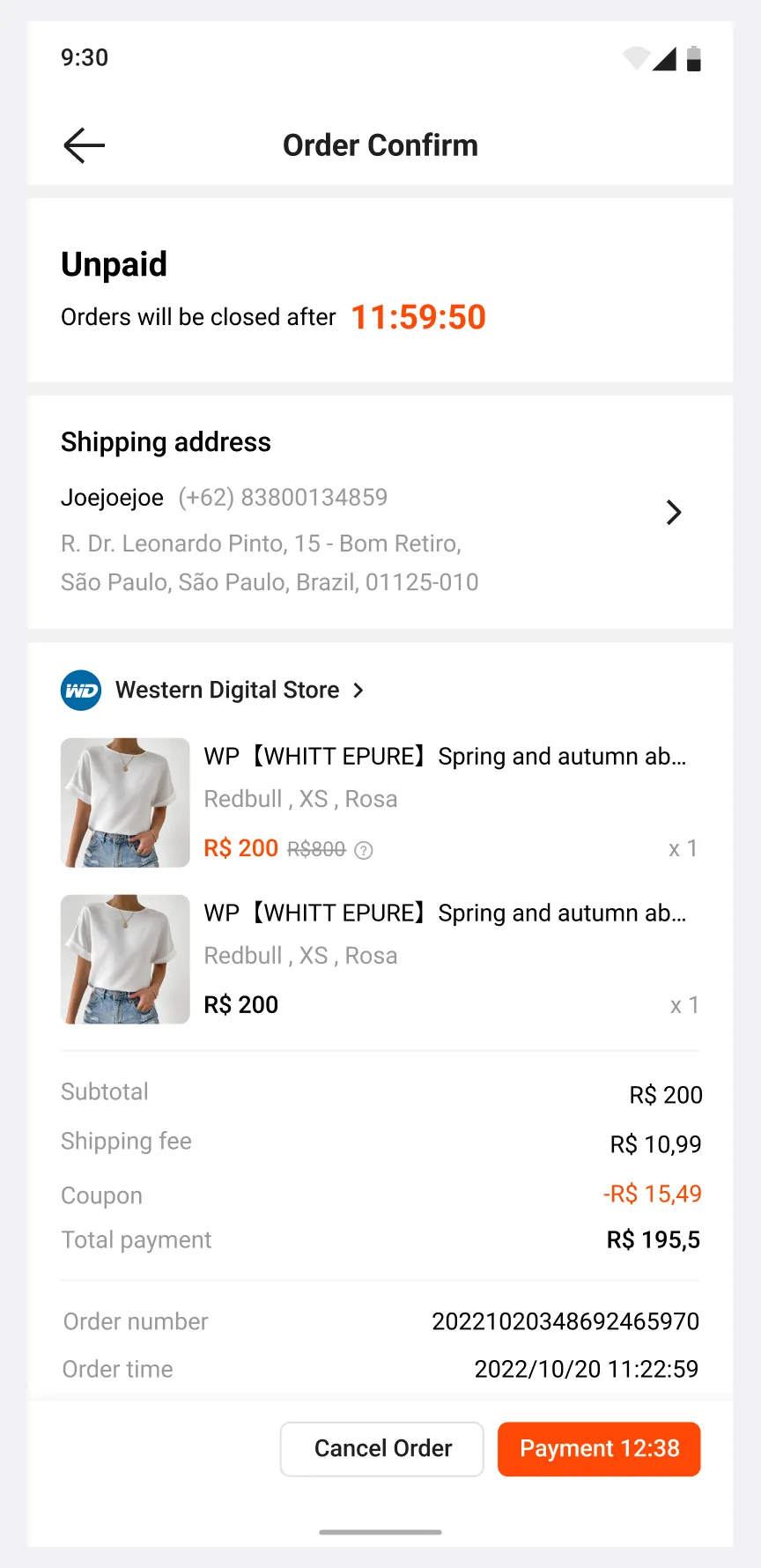
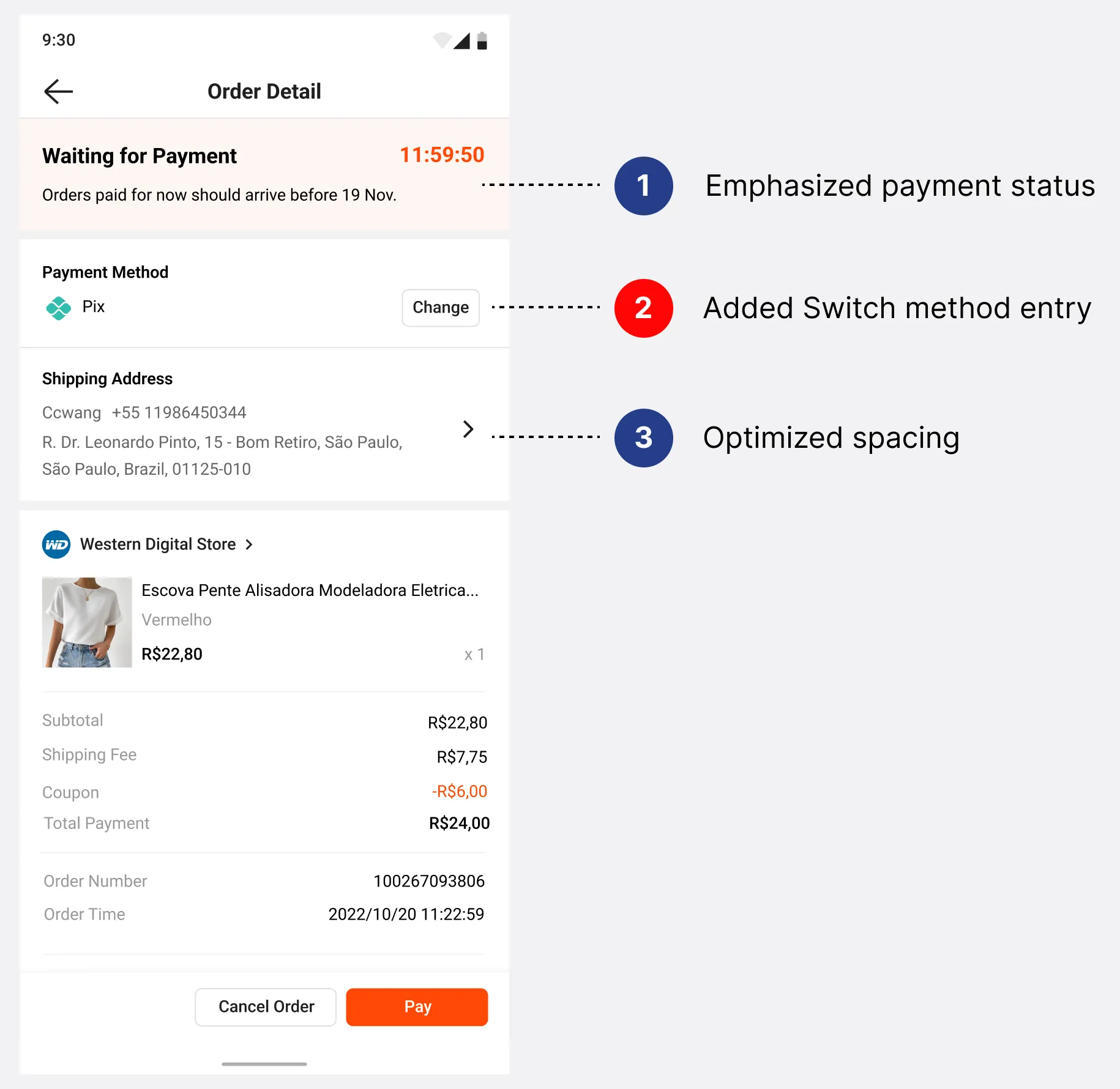
03Order detailAn emphasized payment status and a visible payment method with a Change option.
Order detail — before
BEFORE
Order detail — after
AFTER
10

Next step: measuring Part 2

The payment flow redesign was handed off with a two-track experiment plan. Upstream changes, made before the order is created, are measured by conversion to order. Downstream changes, made after the order is created, are measured by payment completion rate.

11

Takeaways

Reorganizing information users already had, based on their own priorities, moved conversion more than adding anything new. And research was most useful when it helped resolve a conflict between a business KPI and what users needed.